Dont count your chickens untill your sure there chickens

here is my composite for "Dont count your chickens untill your sure there chickens".. looked better without the 3 that you cant see inside of but there was only 12 layers there.. so i had to add something..

The idea came to me pretty much straight away.I masked the 12 insides of the eggs and the 3 that you are not able to see inside of.

Design Brief

Logo Design Brief

TV Network

CactusTV

Kids and adults.
kids 10am-4pm.
talked with client possible revising times to
    6am-10am(kids) 
    10am-4pm(adults)
    4pm-6pm(kids) 
    6pm-6am(adults)
Outside is Adults.

24hr Comedy Channel.

Playful, Vibrant, Fun, Extremely Versatile, Lively and Simple.
Likes Comedy Channel Logo.
Not purple unless needed(to close to comedy channel).
Likes how its animated (possible wants it animated and a still).

Different versions for adults and kids. and then the stock overall logo.(detailed and watermark)
Characterised(vector based) 


Logos


I liked this logo because of its very simple use of one colour and basic shape's. To me it is memorable because of the uniqueness of it. I think it will be timeless as there inst any signs of now day trends appearing. Because of its simple nature i believe it is versatile mainly because of its simplicity and uniqueness. It is very appropriate and reflects its nature as a phone operating system.


I dislike this logo because of its complex design. Its simplicity is debatable i personally think it is not. mainly because of the jagged edges and use of 2012 in the background being barely readable. It is however memorable because of these features. It wouldn't necessarily have to be timeless, as it is made for the 2012 Olympic game and wouldn't be used after that date. It would be versatile because if its whitespace around the edges. It is also very appropriate as it gives you the information needed to know what its for.

The only thing i would change about this logo is the use of the 2012 in the background. trying to make it more simple.


Business Cards


Radio Presenter
I liked this card because if its unique use of the card reflecting what he does(Radio Presenter).It is very simple in my eyes because if the text and plain clean design, but some may differ because if the cutout sides. I believe it is memorable because of the uniqueness as stated above. Its memorability would be depending on the users knowledge of technology but most would have a good idea. its versatility inst to great as it wouldn't be able to be put with some objects is it would collide visually. 
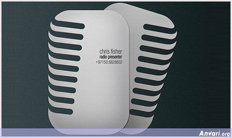
It is very Appropriate as it represents the owners job discription and would be easily recognisable in a pile


Cashmore Meats. 
I Dislike this card because of its overwhelming colour and design. Its is in no way simple and way to overcrowded. It is however Memorable because of the "sheer" horrificness. It is also versatile because if its hard colour borders. It seems to be appropriate as it describes what and who they are.

I would of redone this whole design using more simple design and less vibrant use of colour. i would also not have the images and if i had to i would use vectorized and less detailed copy's. 

Marketplace

Bissness Card

Similar to the website.
plain and easily readable

Logo Designs

Top right is final design.


The Grass Is Always Greener On The Other Side Of The Force... i mean Fence.

I though of this one as a pun and also a movie tradition, as the bad guys always have more equipment but almost always fail in the end..I also though of star wars because of the "other side of the force" pun. and because I know there are a lot of things I could of added.
15 objects are 
5 Spacecrafts, 1 Walker, 6 Droids (different types), and a dark Obi Won which I found on DeviantArt.

40 object underwater scene


Here is my underwater composite. 40 Individual objects as asked. some objects are duplicated but its to add to the effect. I went with a more compact feel with the coral and reeds. animals being on objects like the boat, also in the reeds (bottom left).