Kidsons Logo Final

Here are my logo's submissions for Kidsons Cycles.

I decided to go with a more simplified look choosing minimal elements and colours. 
I believed the original colours orange/blue were suited to Kidsons Cycles as the orange represent joy and happiness and the blue represents health and healing which shows joy through fitness which is a great subliminal message, but as i had to choose another colour scheme i went for brown/green as they both portray a similar style. The green represents health/healing which is close to the blue and the brown represents the earth as well as the racing side of Kidsons.

The wave was a spontaneous attempt to try get me started and thinking which in the end worked out to conceptualize a simplistic Cyclist.
The ideas of the outlines logos(middle pair)came from a motorcyclist logo which had the same concept.
The last conceptual idea was a cyclist which has been done many times by many cycling business's but with a minimal 2 lined drawing to keep my idea of simplistic.


The final two designs are based off both Matt Drake and Tania's logos with slight modifications to make it more appealing to me.
The topmost is a alteration of Matt's with the use of the gear cog. then i remade the cog and added a slight slant to the text and vector work to give it more emotion.
The second uses the font Tania had with the cyclist i made for my previous designs
they were both  made in the original kidsons colours and the alteration as specified. As well as the colours swapped just for personal preference of the audience. 

All the information on colour theory for this assessment has been from 
http://www.color-wheel-pro.com/color-meaning.html

Kidsons Cycles Logo's


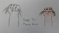
Rapid Logo Study - Snappy Jims

During the desingn of the logo i didnt have many conceptual ideas to begin with. I started with a crocodile mouth open then thought it was to complex which didn't fit the brief.
I then tryed drawing a more "typical" logo, drawing a lawnmower running over grass, but as it was typical it wouldnt work in this case.
I finally ended up making the crocodile idea into hedge cutters/clippers.
 My overall design i wasnt to happy with. but as i got 26 it must of provided some brief description.

Abstract Art Using Colour

 Anger

For this design I though of using deep reds and black’s, as these are meant to show anger. The wave pattern is used to show distortion and displacement. The first thing I did was draw up a few boxes with different toned reds so I had a colour guide to work with. Then I started designing the shapes that I Originally was going to have would have been a more staggered and rough look, but went for this design instead because it suited my interpretation of anger. 


 Calm

For this one I used cold colours and subtle waves.The first thing I did was the same as the anger picture, which was drawing up a colour palate. It contained a lot of cool blues and almost whites. The soft blues and use of the waves I believe per sway a smooth and gentle feel. I originally was going to have it smooth (without the subtle waves) but felt against it as it wasn't as appealing. The overall design does contain some darker blues but as these are around the outside they don’t overwhelm the calm and lighter colours.


Excitement

For this design I firstly thought of a colourful explosive effect. I then went and created all the squares and circles using every colour in the default palate. I then arranged the circles into a explosive particle effect, going from the bottom middle, to the top of the page. I resized and distorted some of the shapes to give it a more realistic look and feel. Then I created the lines in the background using the top colour palate. Excitement I feel doesn’t have a designated colour, rather a broad spectrum of colour shown all at once.
Reference's i used for all three
http://library.thinkquest.org/27066/psychology/nlcolorpsych.html
http://www.johnstonespaint.com/roomideas/colourpsy.asp